Video
Watch today’s video here:
Slides
Hover over the slides and press f for full screen. Press ? for a list of keyboard shortcuts.
knitr::include_url("slides3.html")
Script
Tidy data
What and Why is Tidy Data?
There is one concept which also lends it’s name to the tidyverse that I want to talk about. Tidy Data is a way of turning your datasets into a uniform shape. This makes it easier to develop and work with tools because we get a consistent interface. Once you know how to turn any dataset into a tidy dataset, you are on home turf and can express your ideas more fluently in code. Getting there can sometimes be tricky, but I will give you the most important tools. Because…
»Tidy datasets are all alike,
but every messy dataset is messy in its own way.«
— Hadley Wickham
freely adapted from:
»Happy families are all alike;
every unhappy family is unhappy in its own way.«
— Leo Tolstoy
So, how can we recognize tidy data?
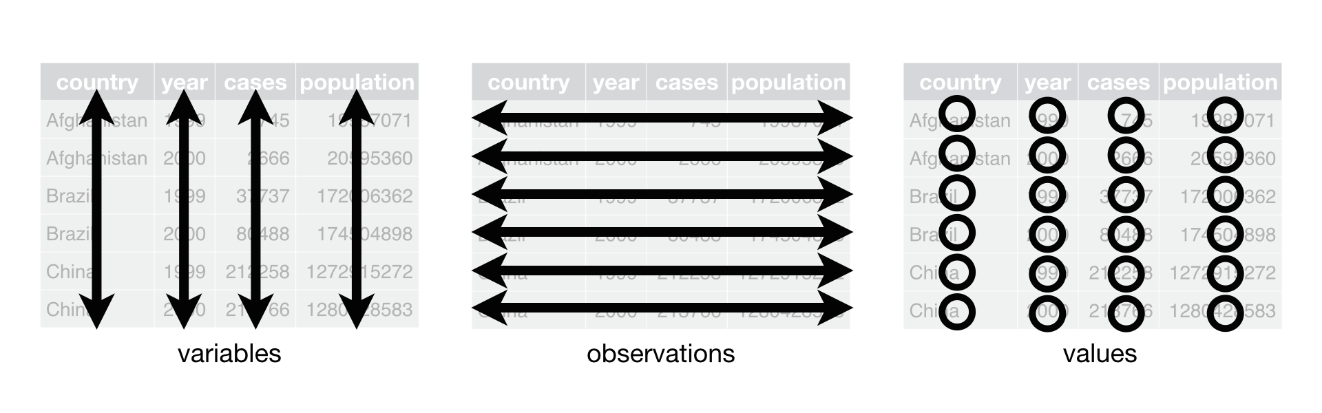
Figure 1: Figure from https://r4ds.had.co.nz/tidy-data.html (Wickham and Grolemund 2017)
In tidy data, each variable (feature) forms it’s own column. Each observation forms a row. And each cell is a single value (measurement). Furthermore, information about the same things belongs in one table.
The tidyr package contained in the tidyverse provides small example datasets to demonstrate what this means in practice. Hadley Wickham and Garrett Grolemund use these in their book as well (https://r4ds.had.co.nz/tidy-data.html)(Wickham and Grolemund 2017).
table1, table2, table3, table4a, table4b, and table5 all display the number of TB cases documented by the World Health Organization in Afghanistan, Brazil, and China between 1999 and 2000. The first of these is in the tidy format, the others are not:
library(tidyverse)

# The paged_table function from the rmarkdown package prints the tables
# for the rmarkdown html document format so that it looks nice in the script.
# Alternatively you could use
# knitr's kable function
paged_table(table1)
This nicely qualifies as tidy data. Every row is uniquely identified by the country and year, and all other columns are properties of the specific country in this specific year.
paged_table(table2)
Now it gets interesting. table2 still looks organized, but it is not tidy (by our definition). Note, this doesn’t say the format is useless — it has it’s places — but it will not fit in as snugly with our tools. The column type is not a feature of the country, rather the actual features are hidden in that column with their values in the count column. In order to make it tidy, this dataset would need to get wider.
paged_table(table3)
In table3, two features are jammed into one column. This is annoying, because we can’t easily calculate with the values; they are stored as text and separated by a slash like cases/population. Ideally, we would want to separate this column into two.
paged_table(table4a)
paged_table(table4b)
table4a and table4b split the data into two different tables, which again makes it harder to calculate with. This data is so closely related, we would want it in one table. And another principle of tidy data is violated. Notice the column names? 1999 is not a feature that Afghanistan can have. Rather, it is the value for a feature (namely the year), while the values in the 1999 column are in fact values for the feature population (in table4a) and cases (in table4b).
paged_table(table5)
In table5, we have the same problem as in table3 and additionally the opposite problem! This time, feature that should be one column (namely year) is spread across two columns (century and year). What we want to do is unite those into one.
Making Data Tidy
with the tidyr package.
Note: I do not go over data is better in another format in this course. Examples for this might involve matrices to benefit from matrix math or their multidimensional equivalent: arrays.
Let’s make some data tidy!
pivot_wider
Starting with table2, which wants to be wider. Accordingly, we use the function pivot_wider. It is very powerful, but the two most important arguments (well, after the data) are which column contains the names of the new columns and which column contains the values of the newly created columns as shown below.
table2 %>%
  pivot_wider(names_from = type, values_from = count)
# A tibble: 6 x 4
  country      year  cases population
  <chr>       <int>  <int>      <int>
1 Afghanistan  1999    745   19987071
2 Afghanistan  2000   2666   20595360
3 Brazil       1999  37737  172006362
4 Brazil       2000  80488  174504898
5 China        1999 212258 1272915272
6 China        2000 213766 1280428583
separate
To make table3 tidy, we need the separate function, followed by mutate to get the new columns into the correct datatype. Run it yourself step by step to see why the mutate afterwards is necessary.
table3 %>%
  separate(rate, into = c("cases", "population"), sep = "/") %>%
  mutate(cases = parse_number(cases),
         population = parse_number(population))
# A tibble: 6 x 4
  country      year  cases population
  <chr>       <int>  <dbl>      <dbl>
1 Afghanistan  1999    745   19987071
2 Afghanistan  2000   2666   20595360
3 Brazil       1999  37737  172006362
4 Brazil       2000  80488  174504898
5 China        1999 212258 1272915272
6 China        2000 213766 1280428583
The parse_ functions come from readr. Parsing is the act of turning raw text into usable data, and the parse_number function does a particularly good job at extracting numbers, where the naïve approach of as.numeric might fail e.g.
some_text = "take my number: 12"
as.numeric(some_text)
[1] NAparse_number(some_text)
[1] 12left_join
Now is the time to join table4a and tabl4b together. For this, we need an operation known from databases as a join. In fact, this whole concept of tidy data is closely related to databases and something called Codd`s normal forms (Codd 1990; Wickham 2014) so I am throwing these references in here just in case you are interested in the theoretical foundations. But without further ado:
# the suffix argument is necessary because the columns
# in the two tables have the same names
table4 <- left_join(table4a, table4b, by = "country",
                    suffix = c("_cases", "_population"))
table4
# A tibble: 3 x 5
  country  `1999_cases` `2000_cases` `1999_populatio… `2000_populatio…
  <chr>           <int>        <int>            <int>            <int>
1 Afghani…          745         2666         19987071         20595360
2 Brazil          37737        80488        172006362        174504898
3 China          212258       213766       1272915272       1280428583
pivot_longer
Now we can deal with the next problem: Making the table longer so that year, population and cases become their own columns again, because they are independent features. Consequently, we use the function pivot_longer:
# note that cols takes what is called a tidyselect specification.
# you know this from the selection function and it's help page.
# here, I am selecting everything BUT the country column.
long_table4 <- table4 %>%
  pivot_longer(cols = -country)
long_table4
# A tibble: 12 x 3
   country     name                 value
   <chr>       <chr>                <int>
 1 Afghanistan 1999_cases             745
 2 Afghanistan 2000_cases            2666
 3 Afghanistan 1999_population   19987071
 4 Afghanistan 2000_population   20595360
 5 Brazil      1999_cases           37737
 6 Brazil      2000_cases           80488
 7 Brazil      1999_population  172006362
 8 Brazil      2000_population  174504898
 9 China       1999_cases          212258
10 China       2000_cases          213766
11 China       1999_population 1272915272
12 China       2000_population 1280428583
But we are not done yet, table4 is putting all our skills to the test. There is a way to do the following steps with pivot_wider straight away, but doing it step by step should be easier to follow. You can revisit this part and check out the other arguments to pivot_wider if you fancy a challenge. The next step we already know: separating a column into two. Only the separator changed.
long_table4_separated <- long_table4 %>%
  separate(col = name, into = c("year", "type"), sep = "_")
long_table4_separated
# A tibble: 12 x 4
   country     year  type            value
   <chr>       <chr> <chr>           <int>
 1 Afghanistan 1999  cases             745
 2 Afghanistan 2000  cases            2666
 3 Afghanistan 1999  population   19987071
 4 Afghanistan 2000  population   20595360
 5 Brazil      1999  cases           37737
 6 Brazil      2000  cases           80488
 7 Brazil      1999  population  172006362
 8 Brazil      2000  population  174504898
 9 China       1999  cases          212258
10 China       2000  cases          213766
11 China       1999  population 1272915272
12 China       2000  population 1280428583
Now we are back to the problem we had in table2, so we know how to make this table wider again:
long_table4_separated %>%
  pivot_wider(names_from = type, values_from = value)
# A tibble: 6 x 4
  country     year   cases population
  <chr>       <chr>  <int>      <int>
1 Afghanistan 1999     745   19987071
2 Afghanistan 2000    2666   20595360
3 Brazil      1999   37737  172006362
4 Brazil      2000   80488  174504898
5 China       1999  212258 1272915272
6 China       2000  213766 1280428583
We did it! Now one last look at table5, which contains a case we haven’t encountered yet: a feature is separated across two columns, so we need the opposite of separeate: unite.
unite
table5 %>%
  unite(col = year, c(century, year), sep = "") %>%
  mutate(year = parse_number(year))
# A tibble: 6 x 3
  country      year rate
  <chr>       <dbl> <chr>
1 Afghanistan  1999 745/19987071
2 Afghanistan  2000 2666/20595360
3 Brazil       1999 37737/172006362
4 Brazil       2000 80488/174504898
5 China        1999 212258/1272915272
6 China        2000 213766/1280428583
Another Example
Let us look at one last example of data that needs tidying, which is also provided by the tidyr package as an example:
head(billboard) %>% paged_table()
This is a lot of columns! For 76 weeks after a song entered the top 100 (I assume in the USA) it’s position is recorded. It might be in this format because it made data entry easier, or the previous person wanted to make plots in excel, where this wide format is used to denote multiple traces. In any event, for our style of visualizations with the grammar of graphics, we want a column to represent a feature, so this data needs to get longer:
long_billboard <- billboard %>%
  pivot_longer(starts_with("w"),
               names_to = "week",
               names_pattern = "wk(\\d+)",
               values_to = "placement",
               values_drop_na = TRUE) %>%
  mutate(week = parse_integer(week),
         date = as.Date(date.entered) + 7 * (week - 1)) %>%
  select(-date.entered)

long_billboard %>%
  head() %>%
  paged_table()
This time I am leaving the visualisation up to you. This is a greate opportunity to play around with ggplot!
This whole tidy data idea might seem like just another way of moving numbers around. But once you build the mental model for it, it will truly transform the way you are able to think about data. Both for data wrangling with dplyr, as shown last week, and also for data visualization with ggplot, a journey we began in the first week and that is still well underway.
More Shapes for Data
The tidyr package provides more tools for dealing with data in various shapes. We just discovered the first set of operations called pivoting to get a feel for tidy data and to obtain it from various formats. But data is not always rectangular like we can show it in a spreadsheet. Sometimes data already comes in a nested form, sometimes we create nested data because it serves our purpose (see next week). So, what do I mean by nested?
Nested Data
Remember that lists can contain elements of any type, even other lists? Well, if have have a list that contains more lists, we call it nested. E.g.
[[1]]
[1] 1 2
[[2]]
[[2]][[1]]
[1] 42
[[2]][[2]]
[[2]][[2]][[1]]
[1] "hi"
[[2]][[2]][[2]]
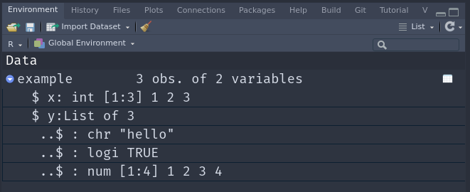
[1] TRUEBut nested list are not always fun to work with, and when there is a straightforward way to represent the same data in a rectangular, flat format, we most likely want to do that. We will deal with data rectangling today was well. But first, there is another implication of nested lists: Because dataframes (and tibbles) are built on top of lists, we can nest them to! This can sometimes come in really handy. We a dataframe contains a column that is not an atomic vector but a list (so it is a list in a list), we call it a list column:
# A tibble: 3 x 2
      x y
  <int> <list>
1     1 <chr [1]>
2     2 <lgl [1]>
3     3 <dbl [4]>
Here, the output in our code only tells us, that the list column y contains an atomic character vector of length 1, a logical vector of length 1 and a double vector of length 4. The overall length of the column is 3, because it has to fit in the tibble.
We can get a better view of what is in there by either pulling the column out with the subsetting functions we already learned (like $, [[]], pull), using str to learn more about the structure or simply using RStudio’s Environment panel to inspect our variable. Click on the name to view it in a new window (the same can be done from code by using the function View or Ctrl+Clicking the variable name) or use the little blue arrow to expand the list.
include_graphics("img/environment.png")
This extends even further, we are about to go full inception on this! A list column can contain tibbles (/dataframes) as well!
nested_tibble <- tibble(
  id = 1:2,
  df = list(
    tibble(x = 1:10, y = x^2),
    tibble(x = seq(1, 100, 3), y = sqrt(x))
  )
)

nested_tibble
# A tibble: 2 x 2
     id df
  <int> <list>
1     1 <tibble [10 × 2]>
2     2 <tibble [34 × 2]>
We can still use the data nested in there, as long as we remember how to chain our subsetting functions together.
# take the column df, take the second element
nested_tibble$df[[2]]
# A tibble: 34 x 2
       x     y
   <dbl> <dbl>
 1     1  1
 2     4  2
 3     7  2.65
 4    10  3.16
 5    13  3.61
 6    16  4
 7    19  4.36
 8    22  4.69
 9    25  5
10    28  5.29
# … with 24 more rows
A handy way to subsett into nested structures is with the pluck function:
nested_tibble %>% pluck("df", 2)
# A tibble: 34 x 2
       x     y
   <dbl> <dbl>
 1     1  1
 2     4  2
 3     7  2.65
 4    10  3.16
 5    13  3.61
 6    16  4
 7    19  4.36
 8    22  4.69
 9    25  5
10    28  5.29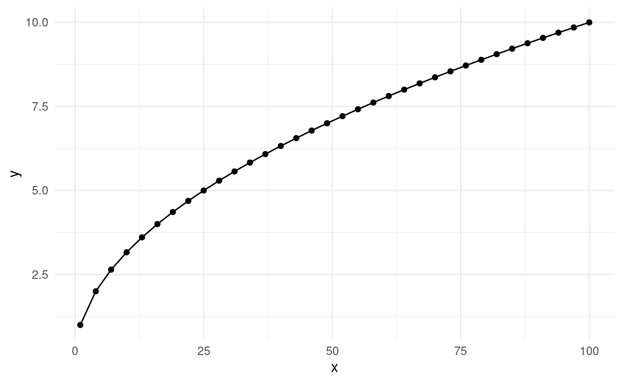
# … with 24 more rowsnested_tibble$df[[2]] %>%
ggplot(aes(x, y)) +
geom_line() +
geom_point() +
theme_minimal()
This will be incredibly useful next week, when we talk about iteration.
Creating a tibble by hand is unlikely going to be the way that you end up with a nested tibble. Let’s create one from an already existing tibble. We can use the long version of the billboard dataset we created above.
# A tibble: 6 x 3
  artist       track                   data
  <chr>        <chr>                   <list>
1 2 Pac        Baby Don't Cry (Keep... <tibble [7 × 3]>
2 2Ge+her      The Hardest Part Of ... <tibble [3 × 3]>
3 3 Doors Down Kryptonite              <tibble [53 × 3]>
4 3 Doors Down Loser                   <tibble [20 × 3]>
5 504 Boyz     Wobble Wobble           <tibble [18 × 3]>
6 98^0         Give Me Just One Nig... <tibble [20 × 3]>
Notice, how similar this is to group_by, except it is much more explicit. The resulting groups are now separated into their own tibble in the list column I named data. Again, RStudio’s environment panel makes it easier to inspect the data.
We can get back to our original shape by unnesting the tibble
nested_billboard %>%
  unnest(data) %>%
  head()
# A tibble: 6 x 5
  artist track                    week placement date
  <chr>  <chr>                   <int>     <dbl> <date>
1 2 Pac  Baby Don't Cry (Keep...     1        87 2000-02-26
2 2 Pac  Baby Don't Cry (Keep...     2        82 2000-03-04
3 2 Pac  Baby Don't Cry (Keep...     3        72 2000-03-11
4 2 Pac  Baby Don't Cry (Keep...     4        77 2000-03-18
5 2 Pac  Baby Don't Cry (Keep...     5        87 2000-03-25
6 2 Pac  Baby Don't Cry (Keep...     6        94 2000-04-01
Unnesting is one special case for the general idea of data rectangling, for which the tidyr package provides more functions. Unfortunately, we can’t all explore them all today.
A Sneak Peak at Iteration
Next week we are going to explore the concept of iteration, having R do one operation for multiple things. But today, I am already giving you a sneak peak at how nested data can help us in that respect. It will also make sure you get more comfortable with writing functions.
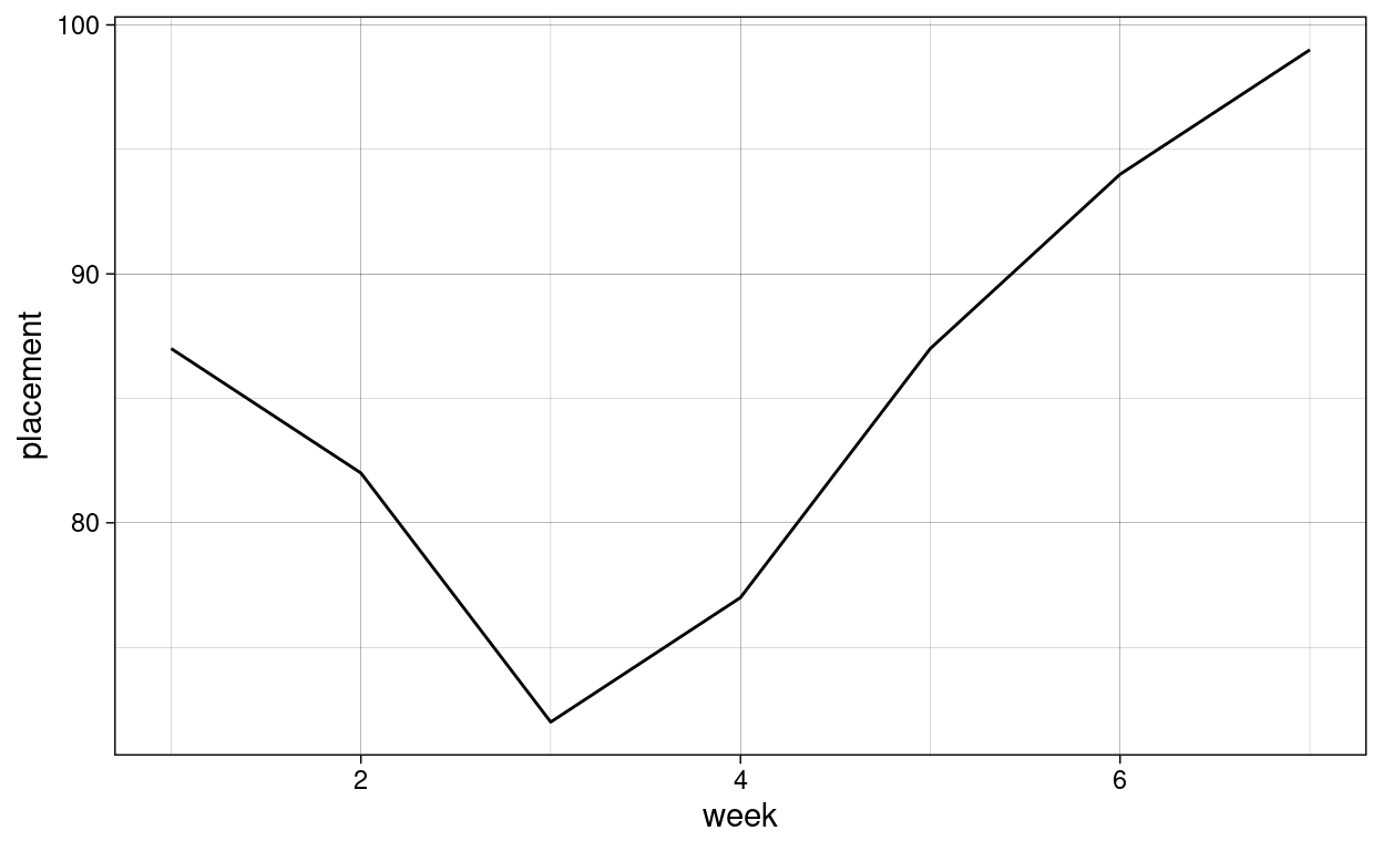
Let us take just one dataset out of the many datasets:
one_track <- nested_billboard$data[[1]]
one_track
# A tibble: 7 x 3
week placement date
<int> <dbl> <date>
1 1 87 2000-02-26
2 2 82 2000-03-04
3 3 72 2000-03-11
4 4 77 2000-03-18
5 5 87 2000-03-25
6 6 94 2000-04-01
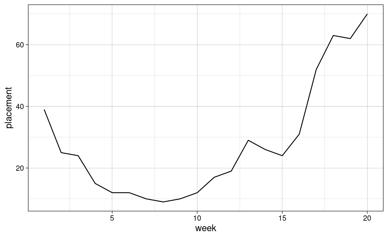
7 7 99 2000-04-08This contains the performance of one song. we can create a plot of it:
ggplot(one_track, aes(week, placement)) +
  geom_line() +
  theme_linedraw()
Moreover, we can create a function, that takes some data and creates a plot from it:
plot_song_performance <- function(song_data) {
  ggplot(song_data, aes(week, placement)) +
    geom_line() +
    theme_linedraw()
}
We can now pass any song data from the nested dataframe to it:
plot_song_performance(nested_billboard$data[[1]])

But we are more ambitious, we want this plot for all songs! The map function from the purrr package takes a list and a function and applies the function to all elements of the list. It is really powerful (and fun). We will learn all about it next week, but here is a preview:
song_performance <- nested_billboard %>%
   mutate(
      plt = map(data, plot_song_performance)
   )

song_performance %>% head()
# A tibble: 6 x 4
  artist       track                   data              plt
  <chr>        <chr>                   <list>            <list>
1 2 Pac        Baby Don't Cry (Keep... <tibble [7 × 3]>  <gg>
2 2Ge+her      The Hardest Part Of ... <tibble [3 × 3]>  <gg>
3 3 Doors Down Kryptonite              <tibble [53 × 3]> <gg>
4 3 Doors Down Loser                   <tibble [20 × 3]> <gg>
5 504 Boyz     Wobble Wobble           <tibble [18 × 3]> <gg>
6 98^0         Give Me Just One Nig... <tibble [20 × 3]> <gg>
And now we can look at individual plots:
song_performance$plt[[24]]
It might have been handy to include a title for the plot, so let’s modify our plotting function a little bit:
plot_song_performance <- function(song_data, title) {
  ggplot(song_data, aes(week, placement)) +
    geom_line() +
    theme_linedraw() +
    labs(title = title)
}
And now we use the function map2 instead of map, which iterates over two vectors at the same time to also pass the plot title:
song_performance <- nested_billboard %>%
   mutate(
      plt = map2(data, track,  plot_song_performance)
   )

song_performance$plt[[1]]

When we don’t care about the return value of a function, but rather about the side-effect it has, we use the walk function in place of map. A side-effect is anything that changes the state of your program or the world around it, as opposed to pure functions, which only depend on their arguments return some value. Writing to a file for example is a side effect:
dir.create("plts")

save_plot <- function(name, plot) {
  ggsave(paste0("plts/", name, ".png"), plot)
}

walk2(song_performance$track, song_performance$plt, save_plot)
Do try this at home, it feels quite good to achieve so much with one key-press!
Exercises
Tidy Data
- Imagine for a second this whole pandemic thing is not going on and we are planning a vacation. Of course, we want to choose the safest airline possible, so we download data about incident reports. You can find it in the data folder1.
- Instead of the
type_of_eventandn_eventscolumns we would like to have one column per type of event, where the values are the count for this event. - Which airlines had the least fatal accidents, standardized to the distance theses airlines covered, in the two time ranges?
- Even if something where to go wrong, which airlines have the best record when it comes to fatalities per fatal accident?
- Create an informative plot to highlight your discoveries. It might be beneficial to only plot e.g. the highest or lowest scoring Airlines. One of the
slice_functions will help you there. And to make your plot prettier, you will have to look intofct_reorderagain.
Functions and Iteration
- You are going strong so far! Programming can sometimes be frustrating, so I think what we need is someone to motivate us. R is up to the task. Write a function that takes a name, like “Jannik” or your name, and spits out a motivational message that includes the name. Make sure to also test it and show that it works.
- Now that you have a motivational machine, you need to make sure to motivate the greatest amount of people. Use the
mapfunction to apply your function to a whole vector of names.
Resources
- tidyr documentation
- purrr documentation
- stringr documentation for working with text and a helpful cheatsheet for the regular expressions mentioned in the video
source: tidytuesday↩︎