Video
Watch today’s video here:
Slides
Hover over the slides and press f for full screen. Press ? for a list of keyboard shortcuts.
Script
Motivation
In the first four lectures we covered the fundamentals of handling data with R. Now, we will shift our focus away from the how and towards the why of data analysis. We will talk about different statistical tests, common mistakes, how to avoid them and how to spot them in other research. But of course, we will do so using R. So you will still learn one or the other useful function or technique along the way. In most instances it should be clear when I use R solely to demonstrate an idea from statistics and the code is just included for the curious, or whether the code is something you will likely also use for your own analysis. I am open for questions if things are unclear in any of the two cases. For purely aesthetic code I might also speed up the typing in the edit.
To understand statistics means understanding the nature of randomness first.
You might not be shocked that we will be using the tidyverse today as well, simply because it makes the data wrangling for various demonstrations easier. So if you are following along, don’t forget:
Statistically Significant…
…you keep using that word. I don’t think it means what you think it means.
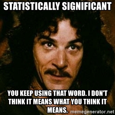
Figure 1: A Meme where a person says: “Statistically significant. You keep using that word. I don’t think it means what you think it means.”
You will hear the phrases “statistically significant,” “significant” or even “very significant” thrown around quite a bit in academic literature . And while they are often used carelessly, they have a clearly defined meaning. A meaning we will uncover today. This meaning is related to the concept of so called p-values, which have an equally bad reputation for frequently being misused. The p in p-value stands for probability, so in order to understand p-values, we need to understand probability and learn how to deal with randomness, chance, or luck if you will. So…
Getting our Hands dirty with Probability

Figure 2: A ggplot chessboard
Say you and you friend are playing a game of chess, when your friend proudly proclaims:
“I am definitely the better player!”
“Proof it!” you reply.
“That’s easy,” she says: “I won 7 out of the 8 rounds we played to today.”
“Pah! That’s just luck.” is your less witty and slightly stubborn response.
As expected, we shall be using R to resolve this vital conflict.

Figure 3: “Artwork by @Allison_horst” (2020)
Definitions: Hypothesis
Both of you involuntarily uttered an hypothesis, a testable assumption. And we want to test these hypothesis using statistics. The first hypothesis (“I am the better player.”) is what we call the alternative hypothesis (\(H_1\)). The name can be a bit confusing, because most often, this is your actual scientific hypothesis, the thing you are interested in. So, alternative to what? It is alternative to the so called null hypothesis (\(H_0\)), which is the second statement (“This is just luck”). The null hypothesis provides a sort of baseline for all our findings. It usually goes along the lines of “What if our observations are just based on chance alone?” where “chance” can be any source of random variation in our system.
The tricky part is that there is no way to directly test the alternative Hypothesis, all we can test is the null hypothesis. Because for any null hypothesis we discard, there are always multiple alternative hypothesis that could explain our data. In our example, even if we end up discarding the idea of our friend’s chess success being only down to luck, this does not prove the alternative hypothesis that she is the better player (she could still be cheating for example). Do keep this in mind when we transfer this to a more scientific setting. Just because we show that something is unlikely to have arisen by chance does not mean that your favorite alternative hypothesis is automatically true.
So, after these words of warning, let’s test some null hypothesis!
Testing the Null Hypothesis with a Simulation
We will start off by building a little simulation. Before testing any hypothesis, it is important to have defined \(H_0\) and \(H_1\) properly, which we did in the previous section. But we need to be a little more specific. Winning by chance would entail a completely random process, which we can model with a coin flip. R has the lovely function sample to take any number of things from a vector, with or without replacement after taking each thing:
Not giving it a number of things to draw just shuffles the vector, which is fairly boring in the case of just two tings. We can’t sample 10 things from a vector of only two elements
sample(coin, size = 10)
Error in sample.int(length(x), size, replace, prob): cannot take a sample larger than the population when 'replace = FALSE'But we can, if we put the thing back every time:
sample(coin, size = 10, replace = TRUE)
 [1] "heads" "heads" "heads" "heads" "heads" "heads" "tails" "tails"
 [9] "heads" "heads"
So, let’s make this a little more specific to our question:
winner <- c("you", "friend")
random_winners <- sample(winner, size = 8, replace = TRUE)
random_winners
[1] "friend" "you"    "you"    "friend" "you"    "friend" "friend"
[8] "you"
This script will look different every time I run this, so I won’t be to specific on the outcome of this. This time, you won:
sum(random_winners == "you")
[1] 4times, and your friend won:
sum(random_winners == "friend")
[1] 4times. If we were to run this script a million times, the resulting proportion of random wins for both of you would be very, very close to 50-50 because we used a fair coin. However, we don’t have the time to play this much Chess and we sure don’t have the money to run a million replicates for each experiment in the lab. But here, in our little simulated world, we have near infinite resources (our simulation is not to computationally costly).
One trick used above: When we calculate e.g. a sum or mean, R automatically converts TRUE to 1 and FALSE to 0.
I created a function that returns a random number of wins your friend would have gotten by pure chance for a number of rounds N.
get_n_wins(10)
[1] 6This number is different every time, so how does it change?
A histogram is a type of plot that shows how often each value occurs in a vector. Usually, the values are put into bins first, grouping close values together for continuous values, but in this case it makes sense to just have one value per bin because we are dealing with discrete values (e.g. no half-wins). Histograms can either display the raw counts or the frequency e.g. as a percentage. In ggplot, we use geom_bar when we don’t need any binning, just counting occurrences, and geom_histogram when we need to bin continuous values.
tibble(number_of_wins) %>%
  ggplot(aes(number_of_wins)) +
  geom_bar() +
  scale_x_continuous(breaks = 0:8) +
  labs(title = "Throwing a coin 8 times")
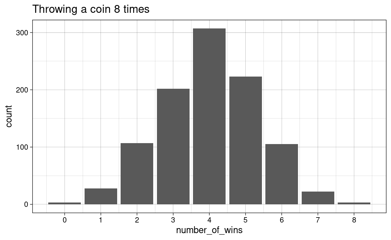
As expected, the most common number of wins out of 8 is 4 (unless I got really unlucky when compiling this script). Let us see, how this distribution changes for different values of N. First, we set up a grid of numbers (all possible combinations) so that we can run a bunch of simulations:
simulation <-
  crossing(N   = 1:15,
           rep = 1:1000) %>%
  mutate(
    wins = map_dbl(N, get_n_wins)
  )

head(simulation) %>% rmarkdown::paged_table()
And then we use our trusty ggplot to visualize all the distributions:
simulation %>%
  ggplot(aes(wins)) +
  geom_bar() +
  facet_wrap(~ N) +
  labs(title = "Throwing a coin N times")
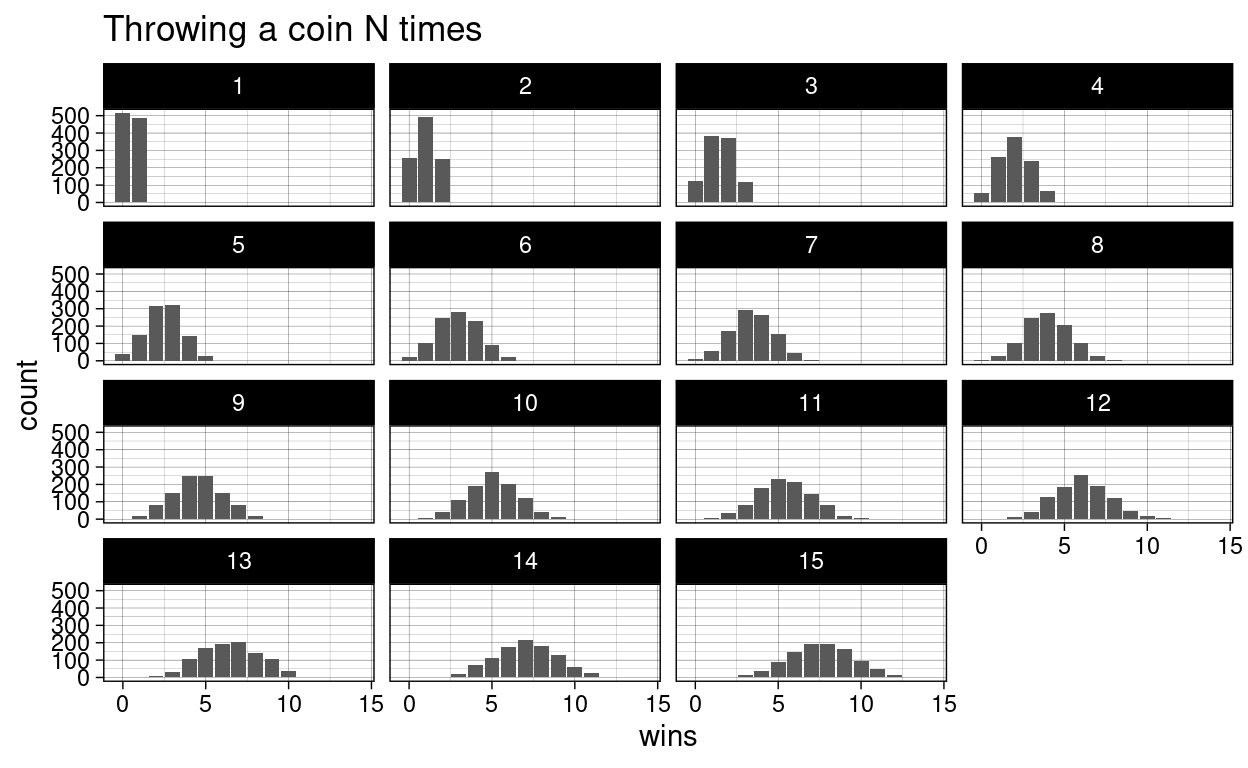
With a fair coin, the most common number of wins should be half of the number of coin flips. Note, how it is still possible to flip a coin 15 times and and not win a single time. It is just very unlikely and the bars are so small that we can’t see them.
Let us go back to the original debate. The first statement: “I am better.” is something that can never be definitively proven. Because there is always the possibility, no matter how small, that the same result could have arisen by pure chance alone. Even if she wins 100 times and we don’t take a single game from her, this sort of outcome is still not impossible to appear just by flipping a coin. But what we can do, is calculate, how likely a certain event is under the assumption of the null hypothesis (only chance). And we can also decide on some threshold \(\alpha\) at which we reject the null hypothesis. This is called the significance threshold. When we make an observation and then calculate that the probability for an observation like this or more extreme is smaller than the threshold, we deem the result statistically significant. And the probability thus created is called the p-value.
From our simulation, we find the that probability to win 7 out of 8 rounds under the null hypothesis is:
mean(number_of_wins >= 7)
[1] 0.025Which is smaller than the commonly used significance threshold of \(\alpha=0.05\) (i.e. \(5\%\)). So with 7 out of 8 wins, we would reject the null hypothesis. Do note that this threshold, no matter how commonly and thoughtlessly it is used throughout academic research, is completely arbitrary.
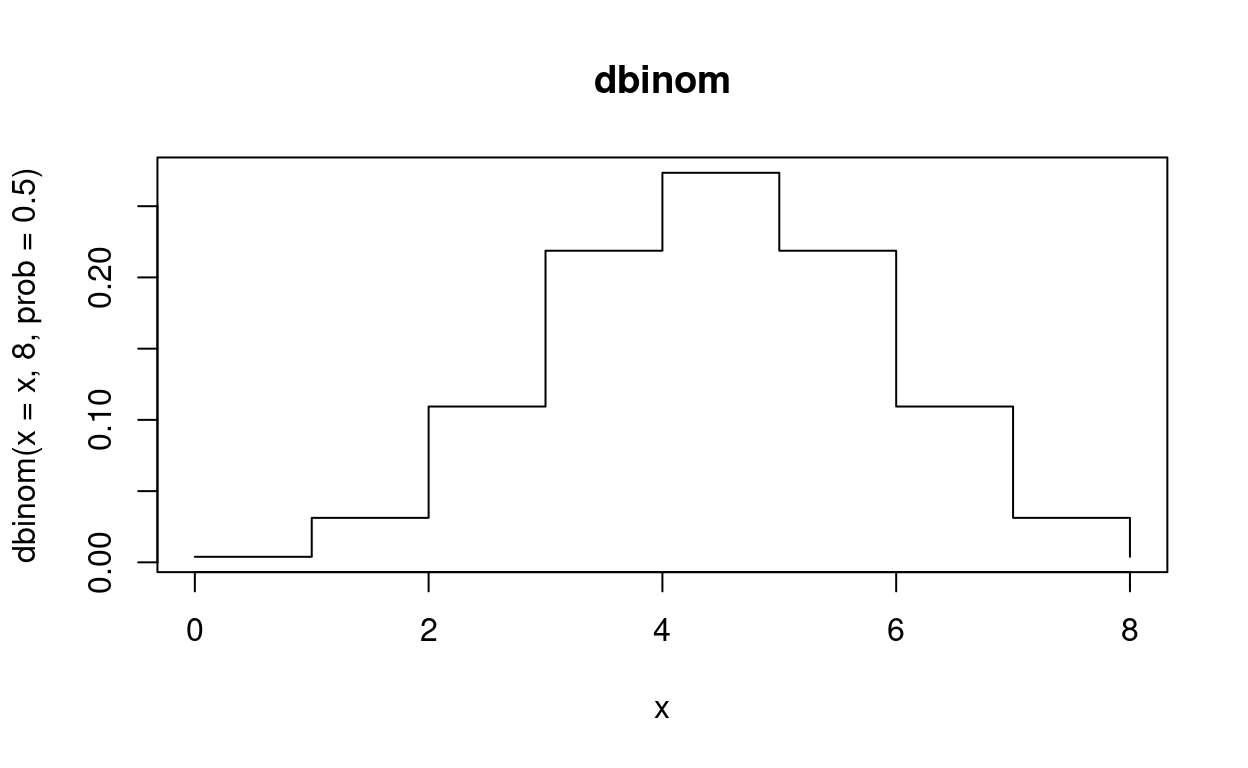
Getting precise with the Binomial Distribution
Now, this was just from a simulation with 1000 trials, so the number can’t be arbitrarily precise, but there is a mathematical formula for this probability. What we created by counting the number of successes in a series of yes-no-trials is a binomial distribution. For the most common distributions, R provides a set of functions. the functions starting with d give us the probability density function. In the case of discrete values like counting wins, this is equivalent to the actual probability, but for continuous values we obtain the probability by taking the integral. We get these integrals with the corresponding functions starting with p (for probability).
dbinom(x = 7, size = 8, prob = 0.5)
[1] 0.03125This is the probability to win exactly 7 out of 8 games. But what we wanted was the probability for 7 or more out of 8! So we move to the integral. This part can get a bit confusing, because the default for pbinom is lower.tail = TRUE, which according to the help page means that probabilities are \(P[X \le x]\).
pbinom(q = 7, size = 8, prob = 0.5)
[1] 0.9960938If we set lower.tail to FALSE , we get \(P[X > x]\), so the probability for a random variable X being bigger than a number x. So to get the probability that we are interested in, we need to replace the 7 with a 6 as well:
pbinom(q = 6, size = 8, prob = 0.5, lower.tail = FALSE)
[1] 0.03515625Our simulation was pretty close! So the exact values agrees and we reject the null hypothesis of both opponents being equally good.
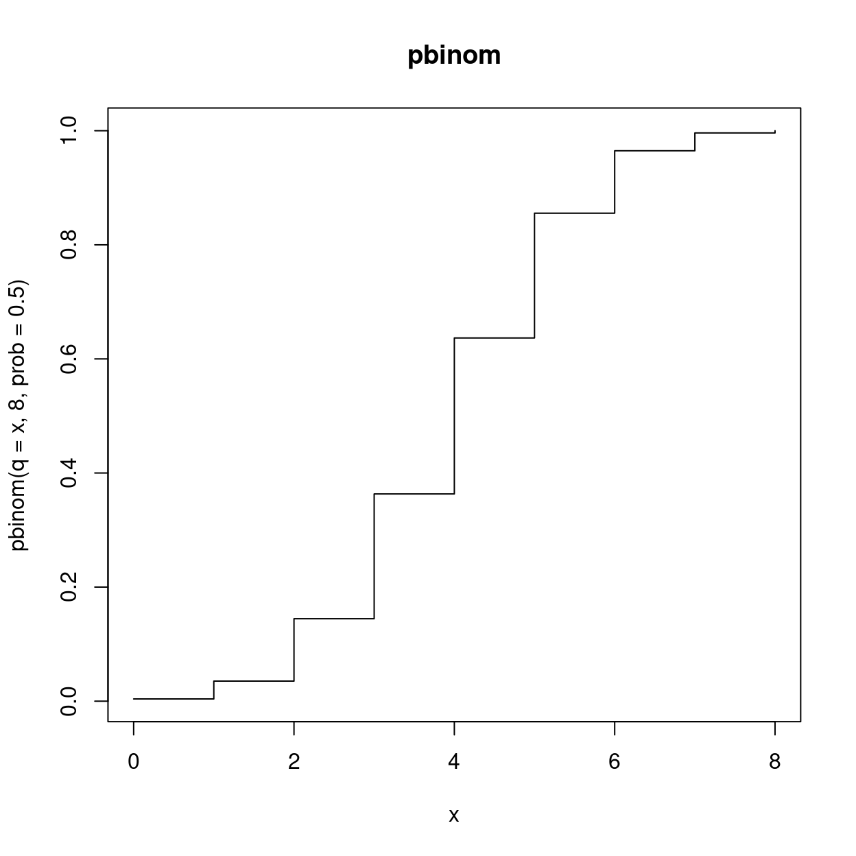
Sidenote: For quick visualizations of function curves I sometimes use plotting functions from base-R rather than ggplot. They are not as powerful and versatile, but efficient at their own small tasks. Just make sure to note that this is not ggplot, so we can’t use our regular repertoire of themes and the likes with it.
Here is the full graph for the probability density function of the binomial distribution
And the integral, the probability \(P[X \le x]\)
There is two more function I want to showcase from this family. The third is the so called quantile function. Quantiles divide a probability distribution into pieces of equal probability. One example for a quantile is the 50th percentile, also known as the median, which divides the values such that half of the values are above and half are below. And we can keep dividing the two halves as well, so that we end up with more quantiles. Eventually, we arrive at the quantile function. It is the inverse of the probability function, so you obtain it by swapping the axis.
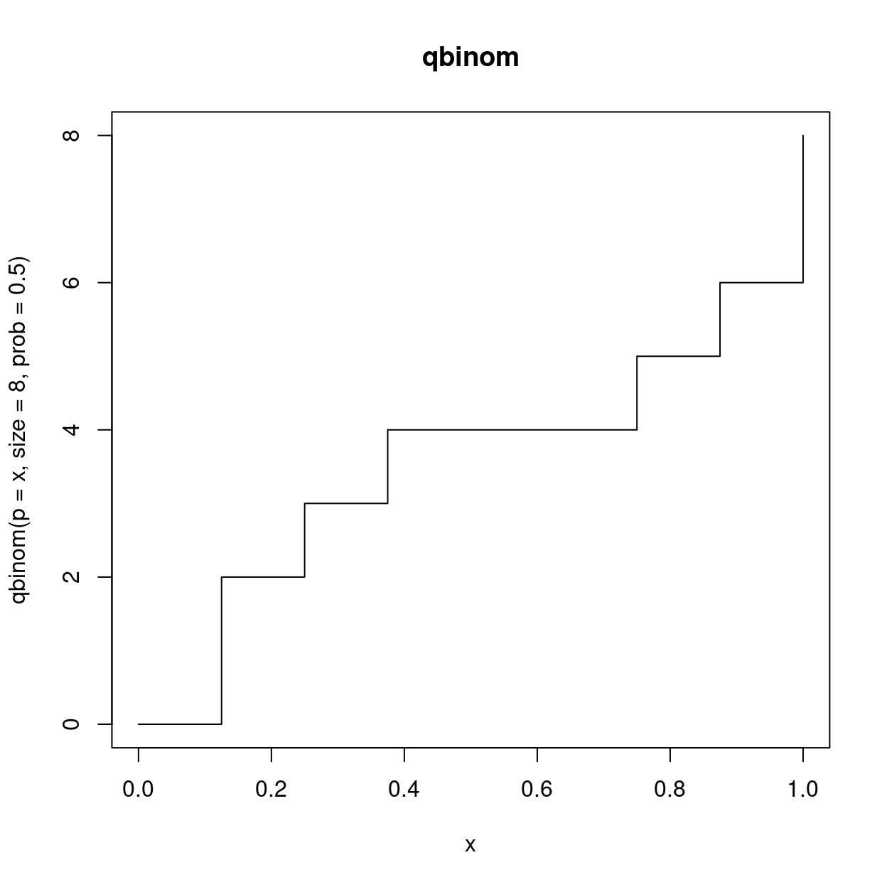
Quantiles will also be useful for deciding if a random sample follows a certain distribution with quantile-quantile plots.
Lastly, there is always also an r variant of the function, which gives us any number of random numbers from the distribution.
rbinom(n = 10, size = 8, prob = 0.5)
[1] 4 5 5 5 5 2 3 4 6 3But how much better? Understanding Effect Size and Power, False Positives and False Negatives
We decided to abandon the null hypothesis that both players are equally good, which equates to a 50% win-chance for each player. But we have not determined how much better she is. And how much better does she need to be for us to reliably discard the null hypothesis after just 8 games? The generalization of the how much better part, the true difference, is called the effect size.
Our ability to decide that something is statistically significant when there is in fact a true difference is called the statistical power. It depends on the effect size, our significance threshold \(\alpha\) and the sample size \(n\) (the number of games). We can explore the concept with another simulation.
set.seed(2020)
trials <- 10000
simulation <- crossing(
  N = c(8, 100, 1000, 10000),
  true_prob = c(0.5, 0.8, 0.9)
) %>%
  rowwise() %>%
  mutate(
    wins = list(rbinom(size = N,
                       prob = true_prob,
                       n = trials)),
    p = list(pbinom(q = wins - 1,
                    size = N,
                    prob = 0.5, lower.tail = FALSE))
    ) %>%
  ungroup()

simulation
# A tibble: 12 x 4
       N true_prob wins           p
   <dbl>     <dbl> <list>         <list>
 1     8       0.5 <int [10,000]> <dbl [10,000]>
 2     8       0.8 <int [10,000]> <dbl [10,000]>
 3     8       0.9 <int [10,000]> <dbl [10,000]>
 4   100       0.5 <int [10,000]> <dbl [10,000]>
 5   100       0.8 <int [10,000]> <dbl [10,000]>
 6   100       0.9 <int [10,000]> <dbl [10,000]>
 7  1000       0.5 <int [10,000]> <dbl [10,000]>
 8  1000       0.8 <int [10,000]> <dbl [10,000]>
 9  1000       0.9 <int [10,000]> <dbl [10,000]>
10 10000       0.5 <int [10,000]> <dbl [10,000]>
11 10000       0.8 <int [10,000]> <dbl [10,000]>
12 10000       0.9 <int [10,000]> <dbl [10,000]>
I also introduced a new piece of advanced dplyr syntax. rowwise is similar to group_by and essentially puts each row into its own group. This can be useful when working with list columns or running a function with varying arguments and allows us to treat the inside of mutate a bit like as if we where using one of the map functions. For more information, see the documentation article.
It leaves us with 10000 simulated numbers of wins at N games for different true probabilities of her winning (i.e. how much better our friend is). We then calculate the probability to have this or a greater number of wins under the null hypothesis (equal probability for win and loss), in other words: the p-value.
simulation %>%
  unnest(c(wins, p)) %>%
  ggplot(aes(p)) +
  geom_histogram() +
  facet_wrap(~ true_prob + N,
             labeller = label_both,
             scales = "free_y",
             ncol = 4) +
  geom_vline(xintercept = 0.05, color = "red") +
  labs(x = "p-value",
       y = "frequency") +
  scale_y_continuous(breaks = NULL)
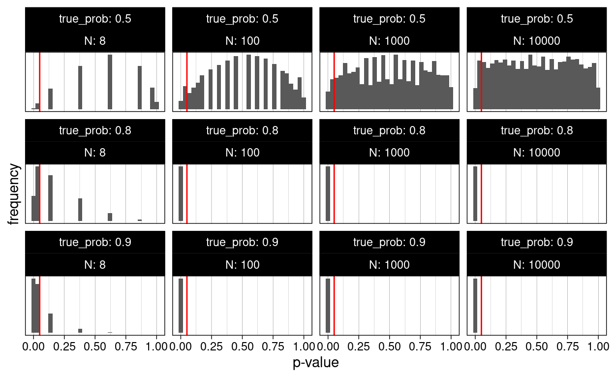
We notice a couple of things in this plot. As the number of games played approaches very high numbers, the p-values for the case where the null hypothesis is in fact true (both players have the same chance of winning), start following a uniform distribution, meaning for a true null hypothesis, all p-values are equally likely. This seems counterintuitive at first, but is a direct consequence of the definition of the p-value. The consequence of this is, that if we apply our regular significance threshold of 5%, by definition we will say that there is a true difference, even though there is none (i.e. the null hypothesis is true but we falsely reject it and favor of our alternative hypothesis). This is called a false positive. By definition, we will get at least \(\alpha\) false positives in all of our experiments. Later, we will learn, why the real number of false positives is even higher. Another name for false positives is Type I errors.
On the other side of the coin, there are also cases where there is a true difference (we used winning probabilities of 0.8 and 0.9), but we don’t reject the null hypothesis because we get a p-values larger than \(alpha\). These are all false negatives and their rate is sometimes referred to as \(\beta\). Another name for false negatives is Type II errors. People don’t particularly like talking about negative things like errors, so instead you will often see the inverse of \(\beta\), the Statistical Power \(1-\beta\). The proportion of correctly identified positives out of the actual positives is also shown on the plot below. For example, say her true win probability is 90% and we play 8 games. If this experiment runs in an infinite number of parallel universes, we will conclude that she is better than chance in 80% of those. We could set our significance threshold higher to detect more of the true positives, but this would also increase our false positives.
simulation %>%
  unnest(c(wins, p)) %>%
  group_by(true_prob, N) %>%
  summarise(signif = mean(p <= 0.05)) %>%
  ggplot(aes(true_prob, signif, fill = true_prob == 0.5)) +
  geom_col(color = "black") +
  geom_text(aes(label = signif), vjust = -0.2) +
  facet_wrap(~N,
             labeller = label_both) +
  scale_y_continuous(expand = expansion(c(0, 0.1))) +
  scale_fill_viridis_d() +
  labs(y = "Proportion of significant results")
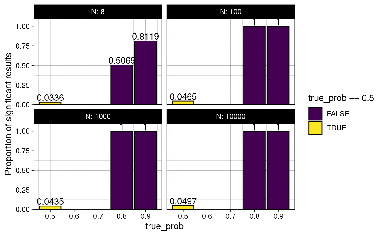
Unfortunately, there is no free lunch in statistics.
There are also packages out there, which have a function to compute the power for the binomial test, but I think the simulation was way more approachable. The cool thing about simulations is also, that they work even when there is no analytical solution, so you can use them to play around when planning an experiment.
P-Value Pitfalls
Let us look into some of the pitfalls of p-values. Remember from the definition of p-values, that we will get a significant result even if there is no true difference in 5% of cases (assuming we use this as our alpha)? Well, what if we test a bunch of things? This is called Multiple Testing and there is a problem associated with it:
If you test 20 different things, and your statistical test will produce a significant result by chance alone in 5% of cases, the expected number of significant results is 1. So we are not very surprised. Speaking of surprised: In his book, available for free online, “Statistics done wrong”, Alex Reinhart describes p-values as a “measure of surprise”:
»A p value is not a measure of how right you are, or how significant the difference is; it’s a measure of how surprised you should be if there is no actual difference between the groups, but you got data suggesting there is. A bigger difference, or one backed up by more data, suggests more surprise and a smaller p value.« — Alex Reinhart (Reinhart 2015)
So, we are not very surprised, but if you focus to hard on the one significant result, trouble ensues. In a “publish or perish” mentality, this can easily happen, and negative findings are not published nearly enough, so most published findings are likely exaggerated. John Bohannon showcased this beautifully by running a study on chocolate consumption and getting it published: I Fooled Millions Into Thinking Chocolate Helps Weight Loss. Here’s How.
What can we do about this?
Multiple Testing Correction
The simplest approach is to take all p-values calculate when running a large number of comparisons and dividing them by the number of tests performed. This is called the Bonferroni correction
[1] 1.000 0.250 1.000 0.005 0.015Of course, this looses some statistical power (remember, no free lunch). A slightly more sophisticated approach to controlling the false discovery rate (FDR) is the Benjamini-Hochberg procedure. It retains a bit more power. Here is what happens:
- Sort all p-values in ascending order.
- Choose a FDR \(q\) you are willing to accept and call the number of tests done \(m\).
- Find the largest p-value with: \(p \leq iq/m\) with its index \(i\).
- This is your new threshold for significance
- Scale the p-values accordingly
And this is how you do it in R:
p.adjust(p_values, method = "BH")
[1] 0.50000000 0.08333333 0.37500000 0.00500000 0.00750000Other forms of p-hacking
This sort of multiple testing is fairly obvious. You will notice it, when you end up with a large number of p-values, for example when doing a genetic screening and testing thousands of genes. Other related problems are harder to spot. For a single research question there are often different statistical tests that you could run, but trying them all out and then choosing the one that best agrees with your hypothesis is not an option! Likewise, simply looking at your data is a form of comparison if it influences your choice of statistical test. Ideally, you first run some exploratory experiments that are not meant to test your hypothesis, then decide on the tests you need, the sample size you want for a particular power and then run the actual experiments designed to test your hypothesis.
At this point, here is another shout-out to Alex Reinharts book (Reinhart 2015). It is a very pleasant read and also shines more light on some of the other forms of p-hacking.
Bayesian Statistics and the Base Rate Fallacy
There is another more subtle problem called the base rate fallacy. As an example, we assume a medical test, testing for a certain condition. In medical testing, different words are used for the same concepts we defined above1.
Here, we have:
- Sensitivity = Power = true positive rate = \(1-\beta\)
- Specificity = true negative rate = \(1-\alpha\)
Let us assume a test with a sensitivity of 90% and a specificity of 92%. When we visit the doctor to get a test, and get a positive result, what is the probability, that we are in fact positive (i.e. a true positive)? Well, the test has a specificity of 92%, so if we where negative, it would have detected that in 92% of cases, does this mean, that we can be 92% certain, that we are actually positive?
Well, no. What we are ignoring here is base rate, which for diseases is called the prevalence. It is the proportion at which a disease exists in the general population.
So, let us say, we are picking 1000 people at random from the population and testing them. We are dealing with a hypothetical condition that affects 1% of people, so we assume 10 people in our sample to be positive. Of those 10 people, 9 will be tested positive (due to our sensitivity), those will be our true positives. The remaining 1 will be a false negative. However, we are of course also testing the negatives (if we knew ahead of time there would be no point in testing) and of those due to our specificity, 8% will also be tested positive, which is 0.08 * 990, so we get 79 false positives. Because there are so many negatives in our sample, even a relatively high specificity will produce a lot of false positives. So that actual probability of being positive with a positive test result is
\[\frac{true~positives}{true~positives + false~positives}=10\%\]

Formally, this is described by Bayes’s Formula
\[P(A|B)=\frac{P(B|A)*P(A)}{P(B)}\]
Read: The probability of A given B is the probability of B given A times the probability of A divided by the probability of B.
In bayesian statistics, the prevalences are known as priors.
Concepts discussed today
After today you should be familiar with the following concepts:
- Null and alternative hypothesis
- P-values and statistical significance
- Binomial distribution
- Probability density, probability and quantile functions
- Effect size and statistical power
- False positives, false negatives
- Multiple testing and p-hacking
- Bayes’s Theorem
Exercises
Just by itself this is quite a bit of material to take in, so I try to limit the exercises for today.
Discovering a new Distribution
The binomial distribution was concerned with sampling with replacement (you can get head or tails any number of times without using up the coin). In this exercise you will explore sampling without replacement. The common model for this is an urn with two different colored balls in it. The resulting distribution is called the hypergeometric distribution and the corresponding R functions are <r/d/p/q>hyper Unfortunately, I couldn’t think of a game that could be modeled by sampling without replacement, let me know, if you find one!
- Imagine you are a zoo manager.
- Get yourselves in the mood by watching some cute animal videos and having a cup of tee or coffee. Here are two red pandas having fun in the snow.
- We got a gift from another zoo! It consists of 8 red pandas and 2 giant pandas. What is the probability that they end up properly separated, if we randomly take 8 animals, put them in one enclosure and put the rest in another?
- Our penguin colony hatched eggs and we have a bunch of newcomers. We have have 15 males and 10 females. If we look at a random subset of 12 penguins, what does the distribution of the number of males look like? Which number is most likely? How likely is it, to get at least 9 males in the sample?
Resources
- https://www.tandfonline.com/doi/full/10.1080/00031305.2016.1154108
- https://jimgruman.netlify.app/post/education-r/
- P-Value histograms blogpost by David Robinson
- “Statistics done wrong”
This is a slightly annoying trend in statistics; as it enters different fields, people come up with new names for old things (perhaps the most notorious field for this is machine learning).↩︎